
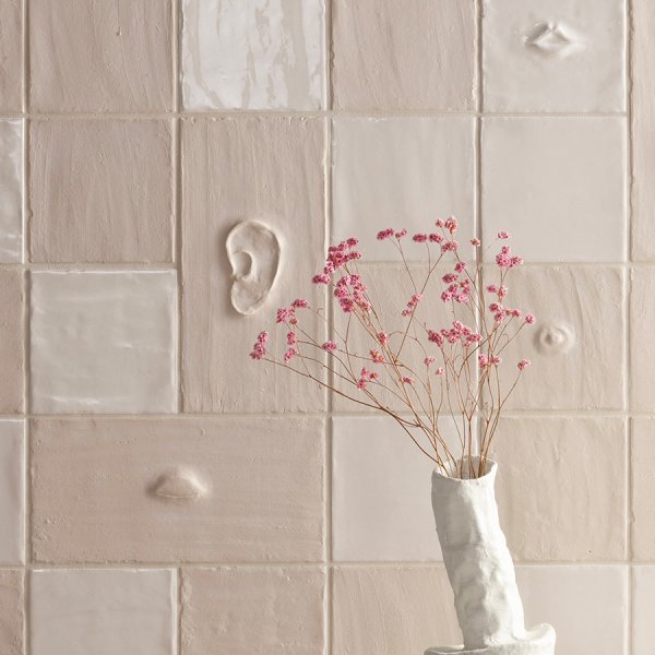
New Arrivals
Faces & Figures
$ 585
/box
Every architect has that moment. The client walks in, looks around, and you know — the surfaces sold the project before you opened your mouth.
The designer ceramics curated by La Mercanti exist for that moment. Born from collaborations between Italy's most progressive ceramic manufacturers and internationally acclaimed designers, these are surfaces that treat tile as an expressive medium — not a spec line to fill and move on.
Why designer ceramics change the entire conversation. There's a gap between a well-furnished office and an office that actually communicates something. The ceramic surface is often what closes that gap.
When you specify designer ceramics for a professional space, you're making a choice most competitors won't: that the surface matters as much as the furniture. That the restroom isn't a utility box — it's an extension of your design intent. That the lobby wall speaks before the receptionist does.
These collections are rooted in material research that goes well beyond aesthetics. Porcelain stoneware with three-dimensional textures that shift with natural light throughout the day. Mosaics where geometry meets deliberate imperfection. Palettes that range from mineral austerity to confident chromatic accents — always with the restraint that separates experimentation from decoration.
Made in Italy, but not the way you've heard it before. This is industrial ceramic craft fused with artisanal intelligence — the subtle irregularities, tonal shifts, and tactile depth you'd expect from handmade work, delivered with the technical consistency and durability of contemporary porcelain stoneware.
Where designer ceramics live in an office project. On the lobby feature wall that tells visitors "something different happens here" before anyone says a word. In the executive corridor where every square foot is a design decision. In the break area the team photographs and posts. In the restroom that extends the interior concept instead of interrupting it.
Every collection is engineered to work across an entire project — floor to wall, entrance to restroom — in one coherent material language. Large-format surfaces for seamless continuity. Artisan mosaics for high-impact focal points. Finishes that recover the depth and warmth of handcrafted ceramic, with performance specs that hold up in high-traffic commercial environments.Project-grade ceramic. Not catalog filler. Explore the collections and find the surface that signs your next project.
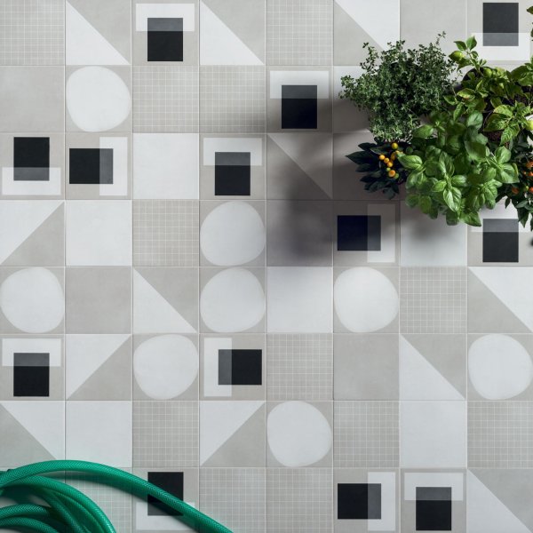
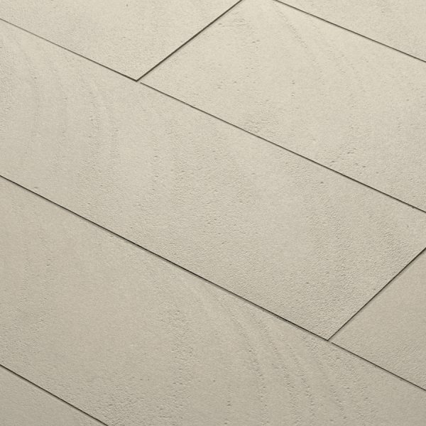
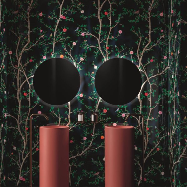

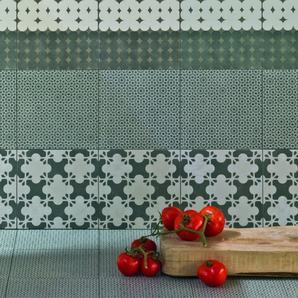
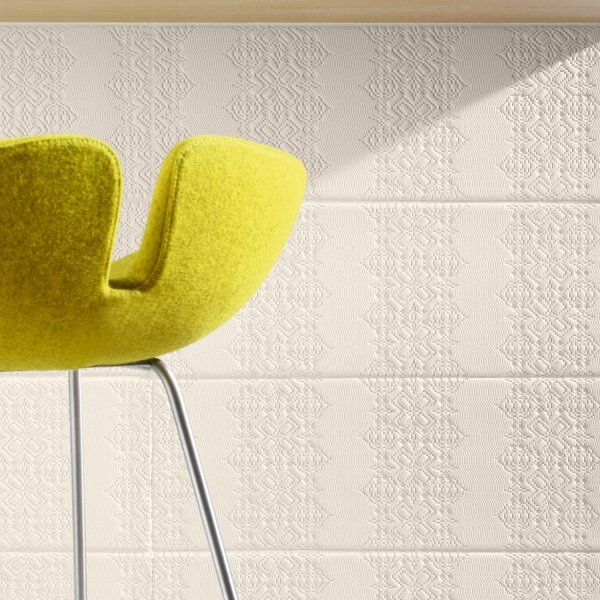
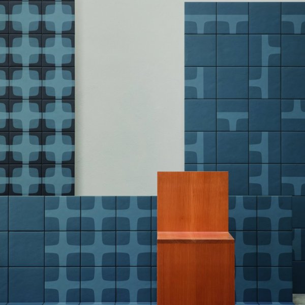
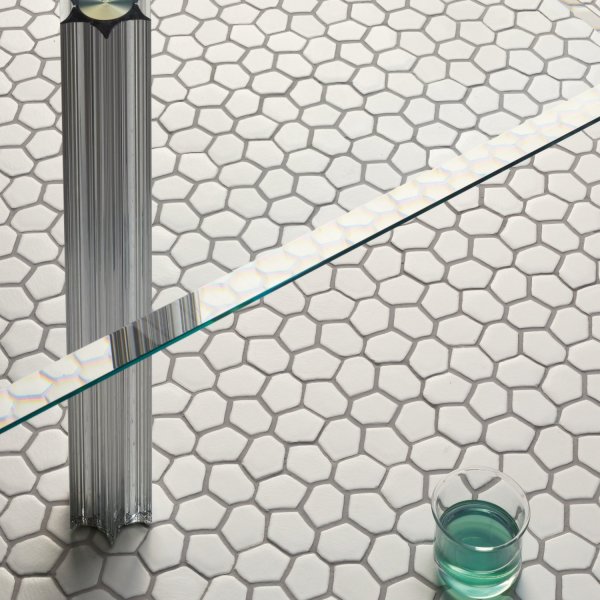
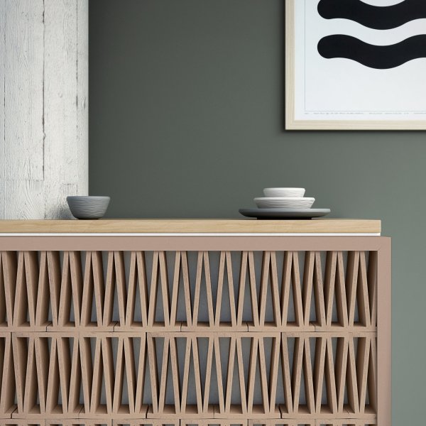
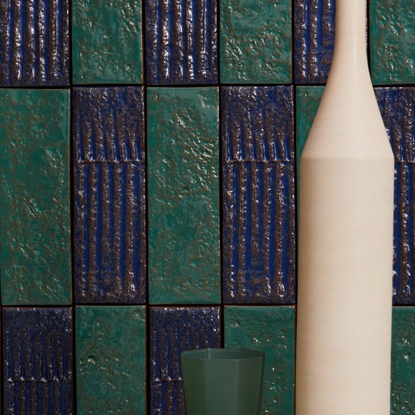
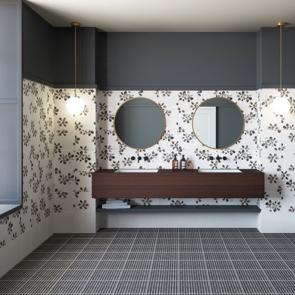
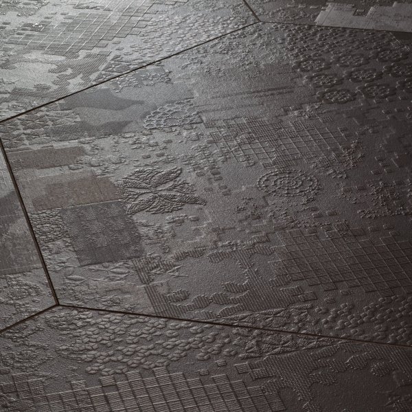
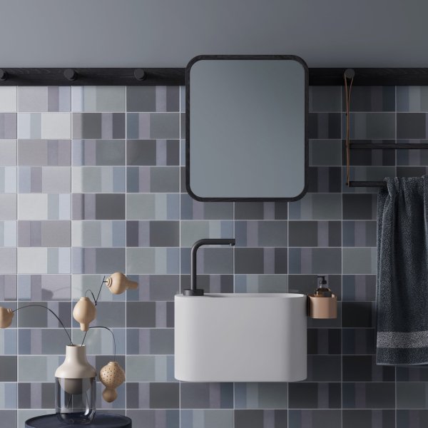
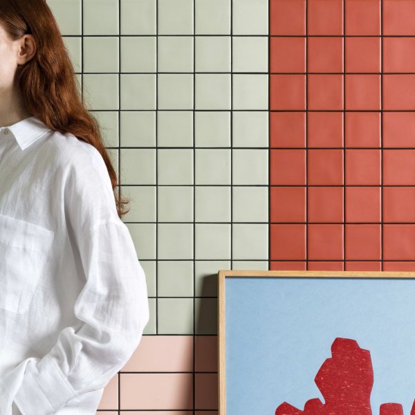
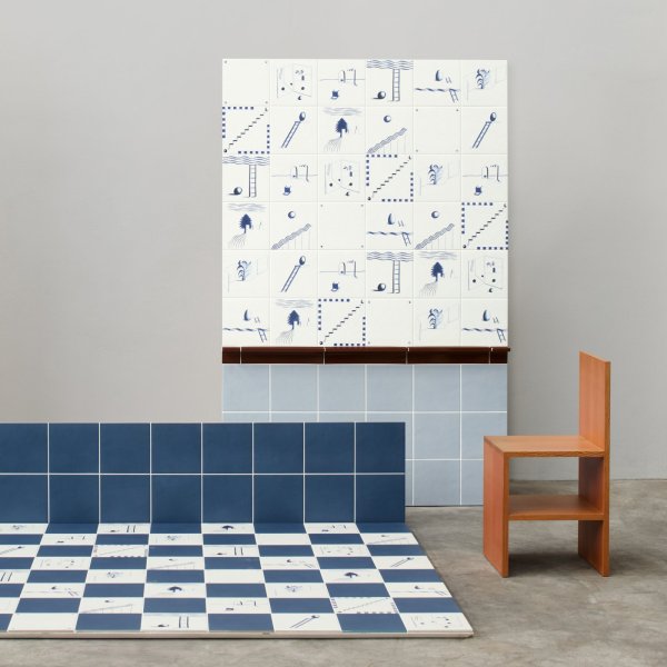
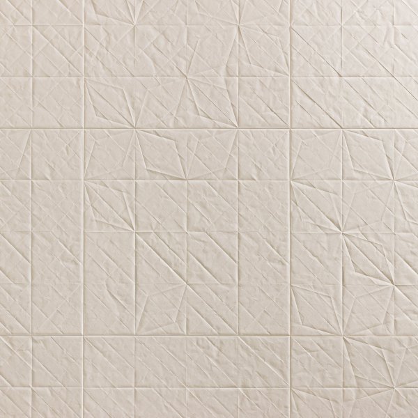
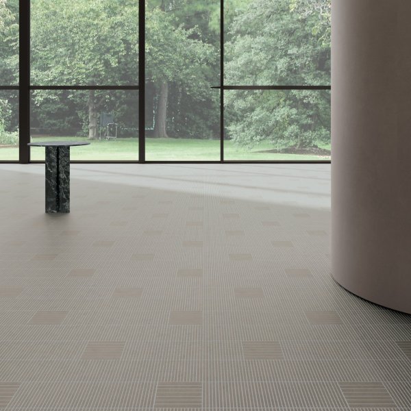
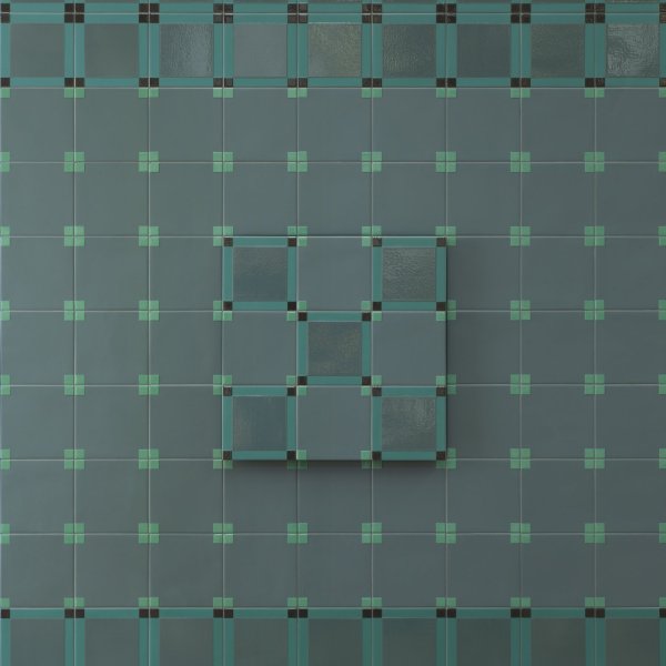
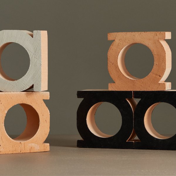
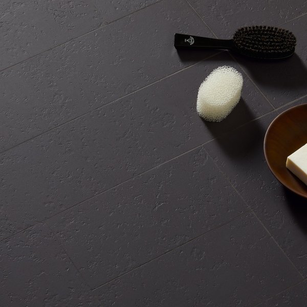
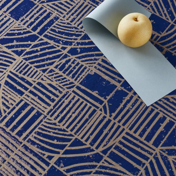
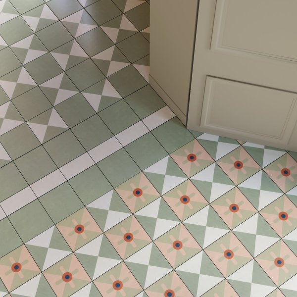
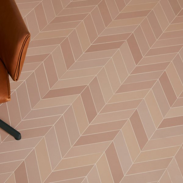
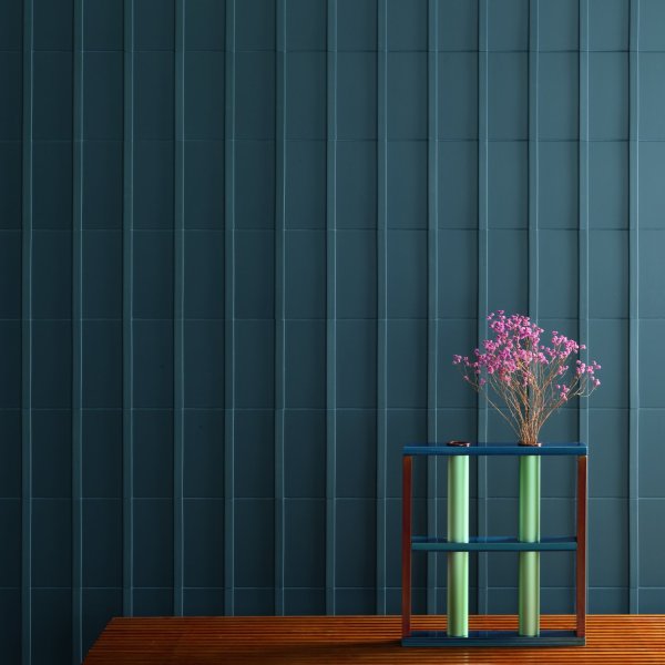
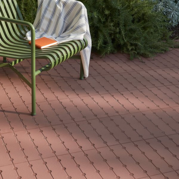
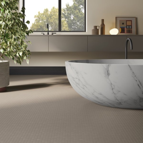
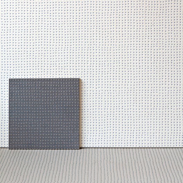
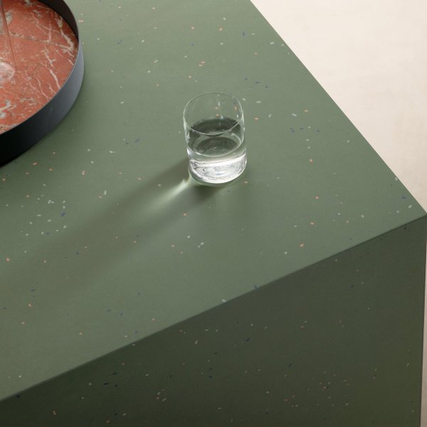

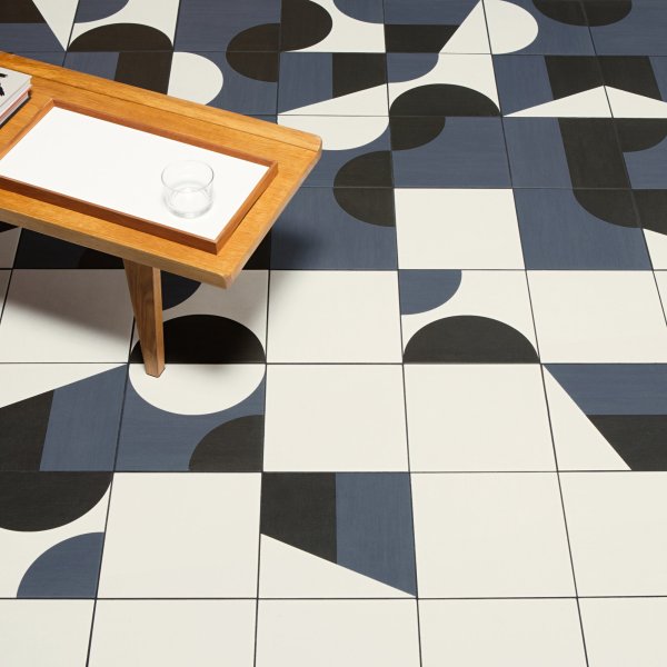
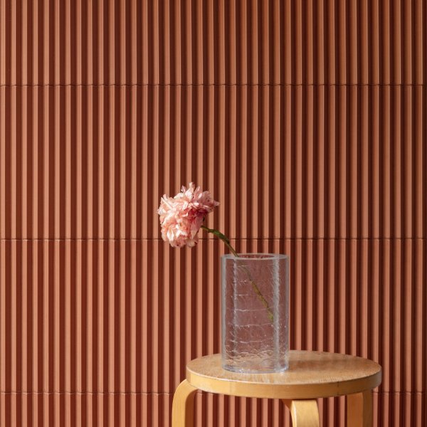
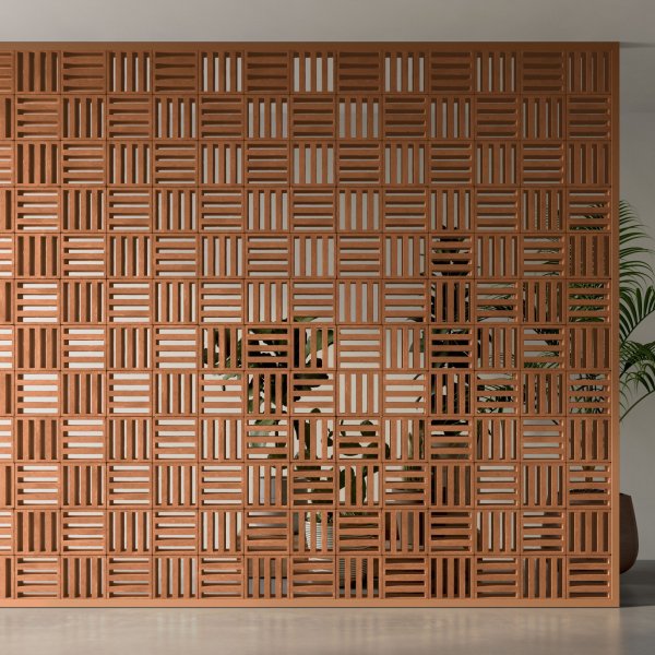
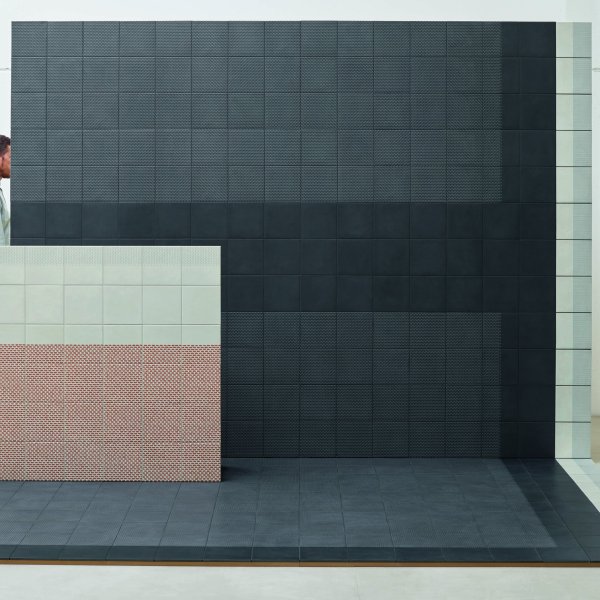
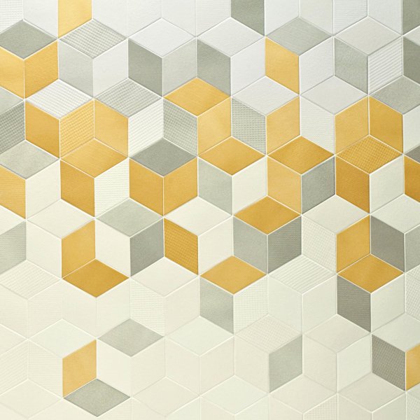
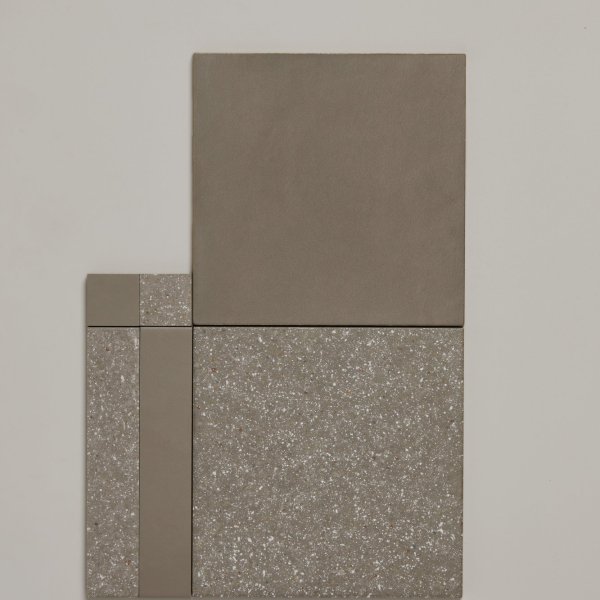
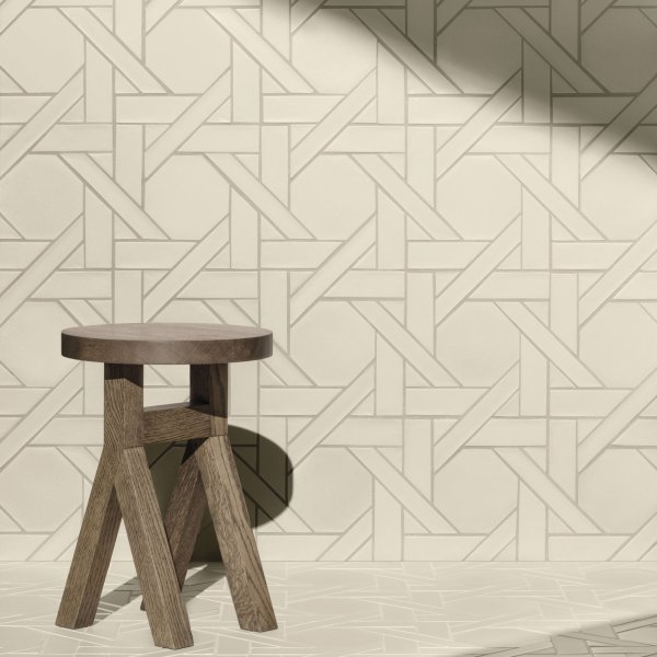
Pick the collection before you pick the rooms. The strongest ceramic specifications start with a single material family and ask: how does this travel? Large-format porcelain takes the reception floor — continuous, authoritative, effortless. The same collection in a matte wall version carries through the corridor. Its three-dimensional relief expression becomes the executive bathroom feature wall. Same DNA, three entirely different spatial experiences. The project gains a coherence that no amount of carefully matched individual pieces achieves — because coherence isn't coordination. It's the same thought, expressed differently. La Mercanti's team walks through the full range of any collection with you before you commit. The project reveals itself in that conversation.
Italian designer ceramics offer a combination that domestic production rarely matches: original surface design by internationally recognized creators, material innovation driven by centuries of ceramic tradition, and an aesthetic range that standard commercial tile simply doesn't reach.
It's not about origin for origin's sake. It's about what happens when industrial ceramic engineering meets a design culture that treats the tile as a creative medium. The textures, tonal variations, and three-dimensional surfaces in these collections don't exist in standard commercial catalogs — because they come from a fundamentally different design process. For an architect looking to differentiate a project, that gap is the entire point.
Because hospitality figured out something corporate is just starting to understand: the surface people touch and see first shapes how they feel about the entire space.
A five-star hotel invests in designer ceramics for lobbies, suites, and restrooms because those surfaces directly influence guest perception — and that perception drives revenue. The same principle applies to a corporate office, but the connection is less obvious until you see it. A lobby clad in authored ceramic surfaces signals to a visiting client, a prospective hire, or a board member that this company pays attention to things others overlook. That signal converts. Hotels have the data to prove it. The corporate world is catching up — and the architects who specify designer ceramics for offices today are the ones their clients thank three years from now.
Because they've seen what happens when a client cuts the ceramic budget — and they've learned that a surface is the one thing you can't upgrade later without tearing the space apart.
Furniture gets swapped. Paint gets refreshed. But the tile on that lobby wall and the restroom floor? That's there for the life of the lease. Your architect pushes for designer ceramics because they know a standard commercial tile will look like every other office on the floor within a year. A designer surface — with its texture, tonal depth, and material intelligence — keeps performing visually and functionally for the entire lifecycle of the project. They're not being difficult. They're protecting the investment and your project's identity. The cost delta between standard and designer ceramic is a fraction of the total fit-out — but it's the fraction people actually notice.
Most office restrooms are designed last and forgotten first. That's a missed opportunity — and every architect who's walked a client through a finished project knows the restroom is the one space that gets commented on every single time, for better or worse. Here's how to make it work for the project, not against it — in three decisions.
Don't treat the restroom as a separate design exercise. Pull the same ceramic collection you used in the lobby, the corridor, or the executive suite into the restroom — same family, different application. A large-format porcelain stoneware on the lobby feature wall can become a mosaic variation in the restroom. Same tonal palette, same material DNA, completely different scale. The visitor walks in and feels continuity, not interruption. That's the moment the restroom stops being a utility room and starts being part of the design story.
The floor is expected. The wall behind the vanity, the accent surface facing the entrance, the niche above the hand dryer — those are the surfaces that create the reaction. A three-dimensional texture on a single wall changes the entire perception of the room. This is where designer ceramics earn their spec: one authored surface does more than four walls of standard tile. Choose the surface with the highest visual impact per square foot and invest there.
Faucets, dispensers, mirrors, lighting — these should follow the ceramic palette, not compete with it. When the ceramic is the protagonist, the hardware becomes supporting cast. Pick the ceramic first, then specify hardware that complements its tone and texture. This reversal of the typical spec sequence is what separates a restroom that looks designed from one that looks assembled.
Result: A restroom that extends your design concept instead of undermining it. A space that clients comment on, teams photograph, and visitors remember. Three decisions. Zero additional square footage.