
Reception & front desk: the first impression, engineered
Entrance, desk, badge, seat: the arrival sequence designed so visitors read exactly what you want them to read.
An entrance is not a piece of furniture. It is the sequence a stranger goes through between the elevator doors opening and someone shaking their hand, and everything in that sequence is designed or left to chance. Where do I go. Who greets me. Where do I wait. Answer those three without words and the counter, the seating and the light nearly choose themselves, because their size and position are already fixed by the sequence.
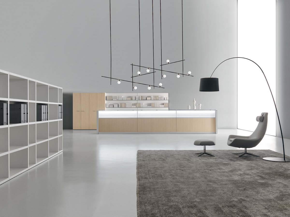
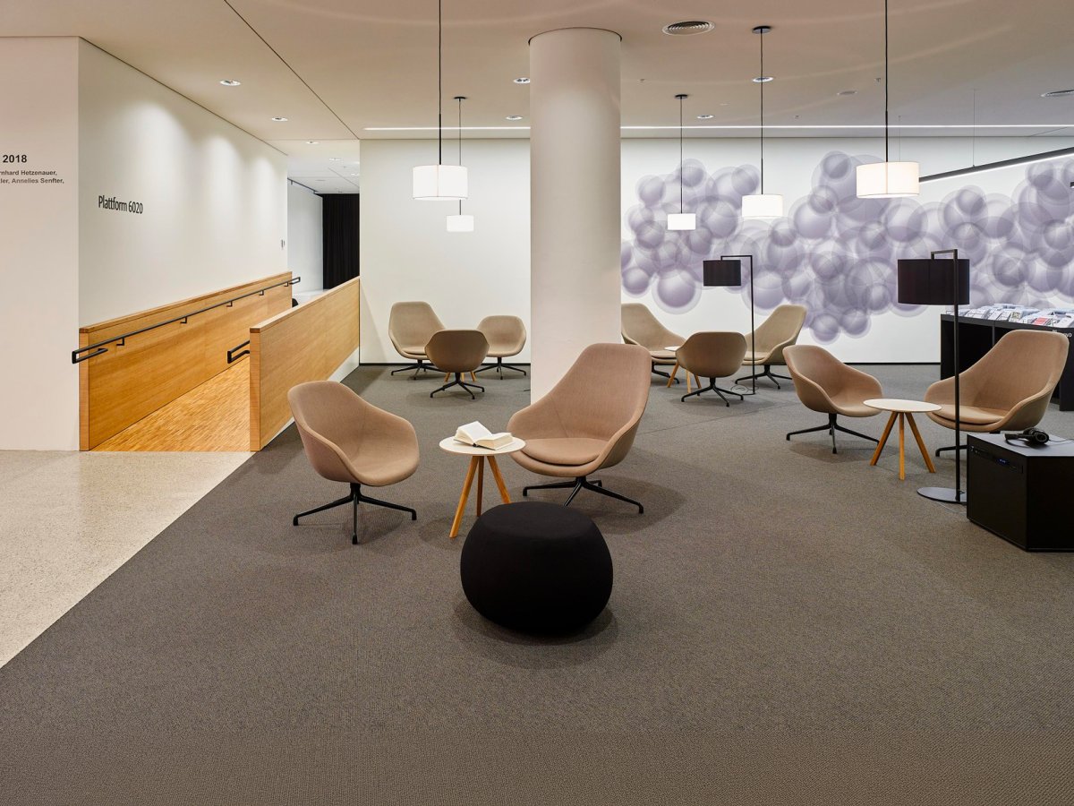
Engineer the sequence, then choose the furniture. Immediate orientation at the entrance; a reception desk that reads as the destination; visitor seating in sight of the action but out of the traffic; the check-in step absorbed into the counter rather than bolted beside it; and an evident route onward. La Mercanti builds reception environments — custom-scaled counters, coordinated guest seating, lighting that flatters both people and material — in one design language with your brand. The arrivals on this page are from delivered projects.
Then there are the hours nobody plans for. The courier at eight. The candidate twenty minutes early. The client who arrives while the receptionist is walking someone else down the hall. An entrance that only works with a person standing behind it is half an entrance. The other half is designed: something to announce yourself with in the first sightline, a lounge chair facing where the host will appear, somewhere for a coat and a roller bag, and the step-free route with the reachable counter section the ADA requires. La Mercanti designs entrances as a sequence, so the floor reads as considered whether or not anyone is standing at the desk.
Inspiration






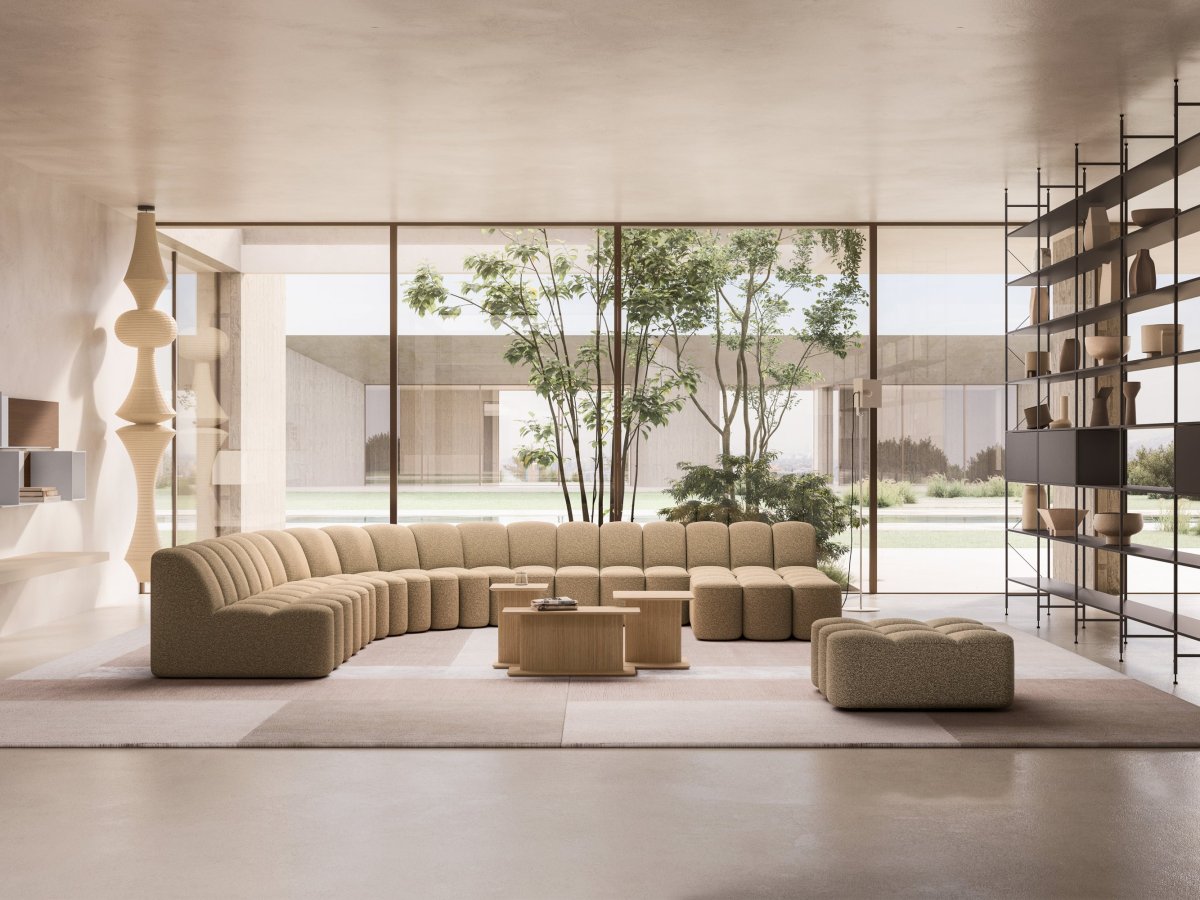
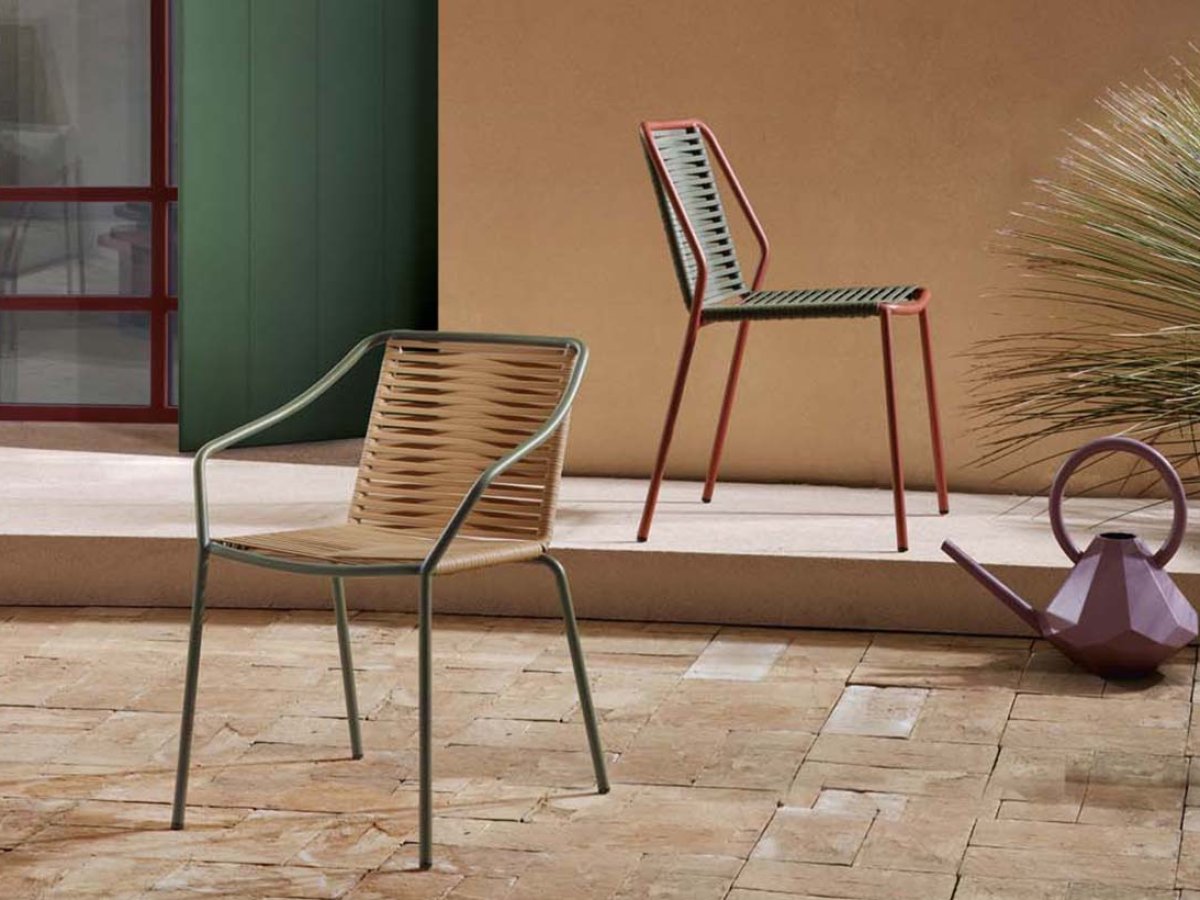
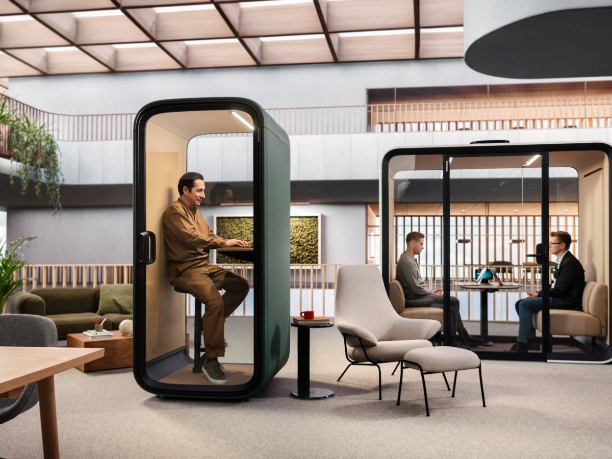
FAQ
What should a visitor experience in the first sixty seconds?
A sequence that answers three questions without words: where do I go, who greets me, where do I wait. Threshold, sightline to the desk, check-in absorbed into the counter, a seat within view but out of the traffic, and an evident route onward. Design the minute, and the furniture choices order themselves; design the furniture first and the minute rarely works. The audit is cheap: play the stranger. Start at the building's street door, clear the security desk, ride up, step off on your floor. Every hesitation you notice is a layout problem, not a signage problem, and it gets solved by moving something, not by printing something. Once the sixty seconds work on paper, the counter, the seating and the lighting almost choose themselves, because their positions and sizes are already fixed.
How do you combine security check-in with hospitality?
By building the badge step into the welcome instead of bolting it beside it. A counter designed for check-in — sign-in surface at the right height, printer out of sight, room for two visitors at once — turns a security requirement into a hosted gesture. The failure mode is familiar: a beautiful desk with a plastic kiosk squeezed next to it, announcing that hospitality and security were designed by different committees. Privacy rides along in the same brief. The visitor log lives on a screen nobody else can read. No printed list of the day's guests sits on the counter. The Wi-Fi password isn't taped to the desk. The badge printer stays on the receptionist's side. Where the building already badges visitors downstairs, your desk greets rather than repeats, and the counter can be lighter. Either way, the visitor should never wonder whether they have been checked in. The layout should say so.
How large should a lobby actually be?
Scale it on the arrival wave, not the floor plate. Count the busiest fifteen minutes — a client meeting day, a candidate slate, a board morning — and give that wave room to check in, wait and move on without crowding. A lobby oversized for its traffic reads corporate-empty; undersized, it turns every arrival into an apology. The wave, not the square footage, is the brief. In numbers: a suite reception built to absorb three simultaneous arrivals needs a counter with room for two, seating for three or four, a wheelchair turning circle, and a coat-and-parcel solution that doesn't spill into the seating. Done well that fits in 200 to 300 square feet. The same program spread across 600 square feet reads as a vacancy. Where the plate hands you more than the wave needs, close the space with a low bookcase, planting and warmer light over the seating rather than letting it echo.
Staffed front desk, or self-check-in?
Let the arrivals decide it. Where most people walking in are clients or candidates, a person behind the counter reads as respect and no kiosk substitutes for it. Where most arrivals are employees, couriers and vendors, a tablet is faster for everyone and frees a salary. Many American offices run both, with someone at the desk through the client hours and self-service early and late. What matters is that neither mode looks like an accident. For the unstaffed hours you need three deliberate pieces: something to announce yourself with, placed where the eye lands coming off the elevator; a chair that faces the direction the host will appear from; and one named person whose phone rings, not a general line. For the staffed hours you need the opposite, a hidden work zone with the printer, the parcels and a surface where being busy does not look like being messy.
What does the ADA require at an office entrance, and where do tenants get it wrong?
The route has to work without a step: entry, a clear path to the counter, room to turn a wheelchair, a lowered counter section at a reachable height, and a way to reach the restrooms and meeting rooms without detour. Doors need maneuvering clearance on both sides and hardware that opens without a tight grip. Contrast and legible signage carry the route for a visitor with limited vision. Where tenants get caught is furniture, not construction: a lounge chair, a plant or a parcel cart placed after handover narrows a clearance that the drawings showed as compliant, and the same objects sit in the egress path the fire marshal will walk. Fix it by giving every loose object a home and marking the clear route on the furniture plan. Best American lobbies make the accessible route the main route, so nobody is sent around the side.
In a multi-tenant building, what is actually left for the tenant to do?
More than the landlord's marketing suggests, and it is the half that matters. The ground-floor lobby, the security desk and the elevators belong to the building and set an expectation your floor either meets or contradicts. The elevator doors open onto your responsibility, and that is where most American tenants under-invest — a corridor with a laminated sign, a glass door, a coat rack. Treat the elevator lobby as the real front door: a name and mark visible the moment the doors part, one clear route, light warmer than the corridor, and a threshold that reads as arrival rather than continuation. Coordinate finishes with the building so your floor feels like an upgrade instead of an argument. And check the base-building hardware while you are at it, since the intercom the visitor uses to reach you may be older than the lease.
How to redesign a lobby without closing it for a day
Receptions can't take a week off. Five steps for a live-site refit — for facilities managers and workplace leads who have to keep receiving clients, candidates and couriers while the counter is being replaced, and who would rather manage the sequence than apologize for it.
Sequence the work back-to-front
Start with the zones a visitor reaches last — waiting, gallery wall — and finish with the counter. The arrival experience degrades least when the first thirty feet are touched last. Draw the phases on the plan with the visitor route in red and ask one question of each phase: on this day, what does a first-time guest see and touch between the elevator and the conference room. Schedule the counter for the final phase, when seating, backdrop wall and lighting are already done, so the new lobby appears as a whole rather than as a construction site with a new desk in it. Make the phasing a contract requirement with the GC, not a preference. On a live site the sequence is the design.
Build the temporary welcome as carefully as the final one
A dressed table, proper signage, a person who greets: for two weeks this IS your reception. Improvised welcomes cost real impressions — brief it like a project, not an apology. Pick a temporary position with a sightline from the elevator, give it a real sign, two decent chairs and a coat rack, and give the receptionist a one-sentence script about the work. Keep check-in running, on a tablet if necessary, so security doesn't lapse while hospitality is on the move. Photograph the setup at nine in the morning and look at the picture as a candidate would. If it reads as a folding table with a printout, it needs another hour before the first arrival.
Move the heavy trades to the building's quiet hours
Counters land, floors get laid and walls get painted before eight or after six. Daytime is for the silent work: styling, lighting adjustments, snagging. Lock in after-hours access, freight elevator slots and noise windows with building management before the schedule is fixed; in most Class A buildings those rules set the timeline more than the trades do. Time deliveries so the counter and the heavy stone or millwork arrive the night they are installed, not to sit under a blanket in the lobby for a week. Keep the daytime crew small and quiet, with a foreman who knows the lobby is occupied. A visitor should never hear a saw, and never see a tool bag on the guest seating.
Protect the route, not just the zone
Visitors will keep crossing the site daily: clean temporary flooring, clear barriers, no cable ever across the walking line. The refit is judged by the worst moment of its route. Make the protection look intentional — a clean runner, proper stanchions, printed signage instead of hand-lettered — and walk the route every morning before the first appointment. Check the accessible route too: a temporary barrier that sends a wheelchair user around the back of the site fails the ADA and the guest at the same time. Keep the path to restrooms and conference rooms free of dust and materials, and put the trades' entry on the far side of the suite if the plan allows.
Soft-open before you announce
Run the finished lobby for a quiet week, walk-test it with fresh eyes, fix the details — then take the photos and tell the world. The relaunch should show the lobby at its best, not at its first. Invite three people who don't know the office to a normal nine o'clock meeting, unassisted, and watch: where they hesitate, where the coat goes, whether they find check-in, whether they know where to wait and which way the host will appear. Sit in the guest chair at four when the sun is low. Ask the receptionist what's missing after five working days. Fix the three biggest issues, then photograph and announce. A relaunch announced before the walk-test invites everyone to notice what the walk-test would have caught.